William Ouyang
------------------------------------------------------
"The Three Words"
Upper Client: Khyzyl Saleem
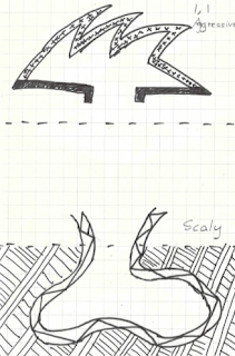
Heavy ----- Advancing ----- Aggressive
Lower Client: Mountain and Moon
Round ----- Suffocating ----- Scaly
"18 Sections"
 Aggressive,Scaly
 Heavy,Suffocating
 Aggressive,Round
Advancing,Scaly
 Heavy, Scaly
 Aggressive, Restricting
 Heavy, Round
 Scaly, Aggressive
 Suffocating, Heavy
 Round, Aggressive
 Scaly, Aggresive
 Suffocating, Advancing
 Scaly, Advancing
 Scaly, Heavy
 Restricting, Aggressive
 Round, Heavy
AND the Final / Best / Chosen Combination:
" Aggressive, Scaly "
"36 Custom Textures"
 Light, Transparent, Sturdy, Smokey, Slimy, Brittle
 Scattered, Flexible, Patterned, Fine, Pixelated,Filtered
 Glowing, Round, Flowing, Layered, Shards, Rippling
 Compressed, Dense, Durable,Shiny, Cubic, Uniform
 Puzzle,Flammable,Geometric,Thin, Fragile, Reflective.
 Hexagonal, Symmetrical, Microscopic, Clustered, Contrasting, Stacked.
"The Developed Stair"
- Layout and relationship of building to the stair is improved and no longer has a "head hitting roof" scenario when walking up the stairs


 ------------------"The Architecture"------------------
The purpose of the building has been designed in regards to both clients, whilst placing high consideration on:
-Relative Size of objects
-Proportions
-Orientation
Aswell as altering the piece from Top to Middle to Bottom as Workshop, Showroom, and then Workshop respectively.
Stage 1:

Stage 2:

Initial Flat Surface at the background with triangular glass shards has been replaced.
Stage 3:
Perspective Shots:
Relative Size: The initial concept of design using the shards in the roof has been adapted and enlarged in size in order to create the entrance. This intends to further portray the feel of "aggressiveness" in which the structure is designed.
Orientation: Placement of the car workshop allows for ample space for the serviced vehicles to lower onto the floor and drive down into the showroom level
Texture and Colour: The car workshop texture consists of broken puzzle pieces whilst the floor runway is contrasting of a completed puzzle piece. This symbolises the construction process as well as the finished process of the cars.
Texture and Colour: The monochromatic and duller colours for this entrance are purposefully used in order to convey that this entrance is for a different showroom as it heavily contrasts to the colourful and glass decor as of the Khyza side.
Relative Size: However, the doorway is designed in a similar manner to the 'scaly' theme of the stairs as the round sections are enlarged and surround the doorway.
 Proportions
: The proportions of the stairs have been manipulated and enlarged in order to create tables in the middle area which is used to display the finished jewellery.
Relative Size: The small size of the steps are enlarged in order to fit the jewellery onto the table. There have also been regular tables placed to show the comparison between the newly made tables.
Relative Size: The small step components from the stairs has been elongated to form a workbench. This elongation of the size of one step is used to create a workbench - better defining the bottom space as a workspace rather than a showroom.
Sectional Perspective Shots:

[Extra]Defining details of the building:
-Broken Jig Saw Puzzle Texture (On the right wall) in the workshop constrasts to the pieced jig saw puzzle in the runway (Floor)
------------------------"End"-------------------------


